ShopDreamUp AI ArtDreamUp
Deviation Actions


Suggested Deviants


Suggested Collections


You Might Like…


Featured in Groups


Description
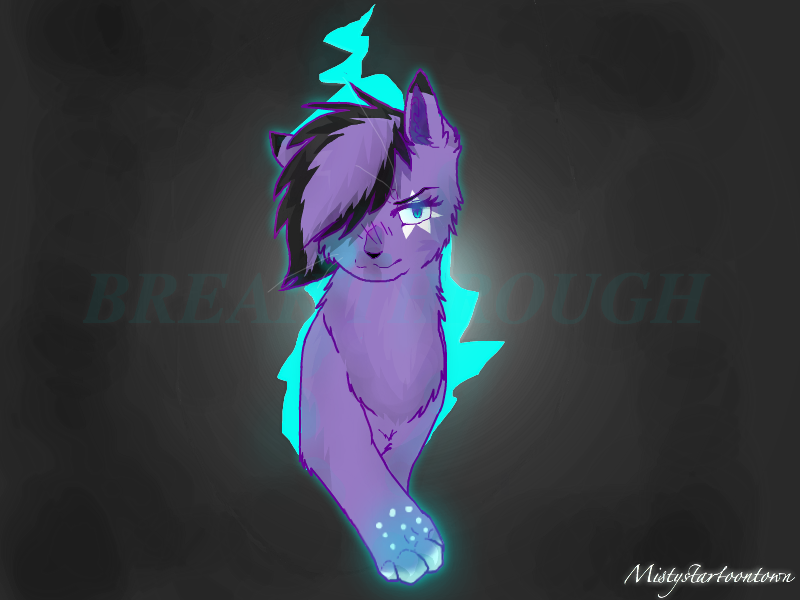
Remake of: 
very bad remake im making another
--
Art/character: Me ©
Made with Sumofm
very bad remake im making another
--
Art/character: Me ©
Made with Sumofm
Image size
800x600px 289.62 KB
© 2013 - 2024 SimplyMisty
Comments79
Join the community to add your comment. Already a deviant? Log In
The color choice in this image is strong; the clean coloring makes the colored lineart look solid, which is a difficult thing to pull off. The anatomy has gotten better in comparison to the previous version of this picture.
Onward to places you could improve, I noticed that a previous critic mentioned how the jagged lines in the background could be better. I advise you to look at images of cracks in concrete or wood to see how the lines travel; they tend to taper towards the end rather than stay the same thickness [link]. Also, on the subject of the wall, I recommend you make the edges of the picture darker. Though the crack/hole in the wall is bright in comparison to the wall color, the contrast could be stronger. I see an attempt at that, so it's a good start, but it needs a little more oomph.
![[link]](https://www.deviantart.com/users/outgoing?http://image.shutterstock.com/display_pic_with_logo/98247/98247,1222101761,1/stock-photo-the-hole-in-the-cracked-old-wall-through-which-is-visible-the-dark-blue-sky-with-clouds-17778661.jpg)
Moving on to the cat...
yes, the muscle placement on the breast is much better than the last image. However, your previous image had a beautiful, strong expression; very fierce, very defiant. Taking that expression away drained the image. The character looks rather "meh" about breaking through rather than ready to conquer the world in the previous image. I think if you combine the clean anatomy with this image with the fierceness in the image before, you could have a very solid piece.
I cannot seem to understand your shading. I see a lot of flecks of blue in places that are facing away from the blue background. What layer setting are you using?
In this case, I would recommend you highlight the portions of the cat in blue that are close to the glowing paw and closest to the blue sky (ie the shoulder blades, the fur on the sides of the face, etc.). Any parts of the cat that are already inside this room she's entering shouldn't be reflecting light from the outside. Is there light hitting the cat from the inside of the room? It looks like you have a front-facing light source, but the room is still very dark. I suggest you see what it looks like when someone is entering a dark room from a lighter room; perhaps look up reference images, or even have someone stand in the doorway of a dark room from a light hallway and watch where the light falls on them, observing from the dark room.
Also I see that both legs are inside the room, but only one paw is..? I'm not sure where the right leg's paw is, or if it's even in the room.
otherwise, solid character design, interesting pose, good, clean coloring. I see you are developing a style, but it's always good to look at references of real cats regardless of your stylistic choice. Best of luck to you! Keep working hard!