ShopDreamUp AI ArtDreamUp
Deviation Actions


Suggested Deviants


Suggested Collections
![[ FeralHeart ] FREE! Scourge Preset](https://images-wixmp-ed30a86b8c4ca887773594c2.wixmp.com/i/b9808c19-a771-44e0-8897-8db9b5632b0d/d9oxnpf-008d8d9a-c25e-4697-bdb4-2c70c91ebc41.png/v1/crop/w_184,h_184,x_49,y_0,scl_0.29821717990276,q_70,strp/__feralheart___free__scourge_preset_by_0abarai0_d9oxnpf-92s-2x.jpg)
![[ FeralHeart ] FREE! Scourge Preset](https://images-wixmp-ed30a86b8c4ca887773594c2.wixmp.com/i/b9808c19-a771-44e0-8897-8db9b5632b0d/d9oxnpf-008d8d9a-c25e-4697-bdb4-2c70c91ebc41.png/v1/crop/w_92,h_92,x_25,y_0,scl_0.14910858995138,q_70,strp/__feralheart___free__scourge_preset_by_0abarai0_d9oxnpf-92s.jpg)


![Patch of Sun [COMMISSION]](https://images-wixmp-ed30a86b8c4ca887773594c2.wixmp.com/f/5a837a0e-fe1c-4e50-92e2-c8b7c6bd1c1c/dcgsiob-104b9449-f765-4861-a245-4afbb1d57507.jpg/v1/crop/w_184,h_184,x_18,y_0,scl_0.074193548387097,q_70,strp/patch_of_sun__commission__by_arven92_dcgsiob-92s-2x.jpg?token=eyJ0eXAiOiJKV1QiLCJhbGciOiJIUzI1NiJ9.eyJzdWIiOiJ1cm46YXBwOjdlMGQxODg5ODIyNjQzNzNhNWYwZDQxNWVhMGQyNmUwIiwiaXNzIjoidXJuOmFwcDo3ZTBkMTg4OTgyMjY0MzczYTVmMGQ0MTVlYTBkMjZlMCIsIm9iaiI6W1t7ImhlaWdodCI6Ijw9OTI3IiwicGF0aCI6IlwvZlwvNWE4MzdhMGUtZmUxYy00ZTUwLTkyZTItYzhiN2M2YmQxYzFjXC9kY2dzaW9iLTEwNGI5NDQ5LWY3NjUtNDg2MS1hMjQ1LTRhZmJiMWQ1NzUwNy5qcGciLCJ3aWR0aCI6Ijw9MTI4MCJ9XV0sImF1ZCI6WyJ1cm46c2VydmljZTppbWFnZS5vcGVyYXRpb25zIl19.Qt-z3jZrZmHFHQxUk1KiDt3xVzG6SecyZ2VQahN1ljo)
![Patch of Sun [COMMISSION]](https://images-wixmp-ed30a86b8c4ca887773594c2.wixmp.com/f/5a837a0e-fe1c-4e50-92e2-c8b7c6bd1c1c/dcgsiob-104b9449-f765-4861-a245-4afbb1d57507.jpg/v1/crop/w_92,h_92,x_9,y_0,scl_0.037096774193548,q_70,strp/patch_of_sun__commission__by_arven92_dcgsiob-92s.jpg?token=eyJ0eXAiOiJKV1QiLCJhbGciOiJIUzI1NiJ9.eyJzdWIiOiJ1cm46YXBwOjdlMGQxODg5ODIyNjQzNzNhNWYwZDQxNWVhMGQyNmUwIiwiaXNzIjoidXJuOmFwcDo3ZTBkMTg4OTgyMjY0MzczYTVmMGQ0MTVlYTBkMjZlMCIsIm9iaiI6W1t7ImhlaWdodCI6Ijw9OTI3IiwicGF0aCI6IlwvZlwvNWE4MzdhMGUtZmUxYy00ZTUwLTkyZTItYzhiN2M2YmQxYzFjXC9kY2dzaW9iLTEwNGI5NDQ5LWY3NjUtNDg2MS1hMjQ1LTRhZmJiMWQ1NzUwNy5qcGciLCJ3aWR0aCI6Ijw9MTI4MCJ9XV0sImF1ZCI6WyJ1cm46c2VydmljZTppbWFnZS5vcGVyYXRpb25zIl19.Qt-z3jZrZmHFHQxUk1KiDt3xVzG6SecyZ2VQahN1ljo)


You Might Like…


![Sorreltail by Dreampool [commission]](https://images-wixmp-ed30a86b8c4ca887773594c2.wixmp.com/f/c2bed319-7fa5-4a96-818f-07dfe0b6f4e3/ddnke0v-04c4a578-c0b1-4125-870a-b0c9c71de095.png/v1/crop/w_184,h_184,x_36,y_0,scl_0.085185185185185,q_70,strp/sorreltail_by_dreampool__commission__by_fenektt_ddnke0v-92s-2x.jpg?token=eyJ0eXAiOiJKV1QiLCJhbGciOiJIUzI1NiJ9.eyJzdWIiOiJ1cm46YXBwOjdlMGQxODg5ODIyNjQzNzNhNWYwZDQxNWVhMGQyNmUwIiwiaXNzIjoidXJuOmFwcDo3ZTBkMTg4OTgyMjY0MzczYTVmMGQ0MTVlYTBkMjZlMCIsIm9iaiI6W1t7ImhlaWdodCI6Ijw9MjE2MCIsInBhdGgiOiJcL2ZcL2MyYmVkMzE5LTdmYTUtNGE5Ni04MThmLTA3ZGZlMGI2ZjRlM1wvZGRua2Uwdi0wNGM0YTU3OC1jMGIxLTQxMjUtODcwYS1iMGM5YzcxZGUwOTUucG5nIiwid2lkdGgiOiI8PTM4NDAifV1dLCJhdWQiOlsidXJuOnNlcnZpY2U6aW1hZ2Uub3BlcmF0aW9ucyJdfQ.dmnbnkEjjygLxhKBNWWiCfbbOihKi1nXHTjUouozmCg)
![Sorreltail by Dreampool [commission]](https://images-wixmp-ed30a86b8c4ca887773594c2.wixmp.com/f/c2bed319-7fa5-4a96-818f-07dfe0b6f4e3/ddnke0v-04c4a578-c0b1-4125-870a-b0c9c71de095.png/v1/crop/w_92,h_92,x_18,y_0,scl_0.042592592592593,q_70,strp/sorreltail_by_dreampool__commission__by_fenektt_ddnke0v-92s.jpg?token=eyJ0eXAiOiJKV1QiLCJhbGciOiJIUzI1NiJ9.eyJzdWIiOiJ1cm46YXBwOjdlMGQxODg5ODIyNjQzNzNhNWYwZDQxNWVhMGQyNmUwIiwiaXNzIjoidXJuOmFwcDo3ZTBkMTg4OTgyMjY0MzczYTVmMGQ0MTVlYTBkMjZlMCIsIm9iaiI6W1t7ImhlaWdodCI6Ijw9MjE2MCIsInBhdGgiOiJcL2ZcL2MyYmVkMzE5LTdmYTUtNGE5Ni04MThmLTA3ZGZlMGI2ZjRlM1wvZGRua2Uwdi0wNGM0YTU3OC1jMGIxLTQxMjUtODcwYS1iMGM5YzcxZGUwOTUucG5nIiwid2lkdGgiOiI8PTM4NDAifV1dLCJhdWQiOlsidXJuOnNlcnZpY2U6aW1hZ2Uub3BlcmF0aW9ucyJdfQ.dmnbnkEjjygLxhKBNWWiCfbbOihKi1nXHTjUouozmCg)


![[AT] dragthelegendarysmn - Eric](https://images-wixmp-ed30a86b8c4ca887773594c2.wixmp.com/i/a6ca5c6d-e7d5-442c-8aca-cbff0dd52dd8/d7qomf9-8f6cea72-182a-41c8-a509-87b917911952.png/v1/crop/w_184,h_184,x_23,y_0,scl_0.30666666666667,q_70,strp/_at__dragthelegendarysmn___eric_by_gwij_d7qomf9-92s-2x.jpg)
![[AT] dragthelegendarysmn - Eric](https://images-wixmp-ed30a86b8c4ca887773594c2.wixmp.com/i/a6ca5c6d-e7d5-442c-8aca-cbff0dd52dd8/d7qomf9-8f6cea72-182a-41c8-a509-87b917911952.png/v1/crop/w_92,h_92,x_12,y_0,scl_0.15333333333333,q_70,strp/_at__dragthelegendarysmn___eric_by_gwij_d7qomf9-92s.jpg)


Description
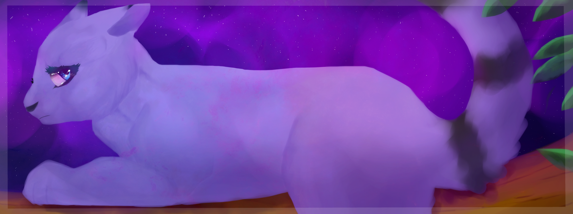
Painting practice of my main OC Mistystar.
--
hEYY GUESS WHAT I FORGOT AGAIN?? ? THE STAR AND THE BACK STRIPE oH yEha
my goodness I can never even get my oc's design right and u know what I only just now realized I forgot those things right when I was typing this.
Yeah, I know It looks unfinished.. I've been working on this for about a week now because of school and other commissions and sai not working..
Still, need to get a tablet for pen pressure. Using a mouse while painting is annoying as crap. But even if I did get a tablet, the mac version of sai I downloaded won't let me.
She's on a branch btw.
Anyways, Please comment/critique(if necessary) if you fav!
--
Done with a mouse and Sai (some additional effects on sumopaint)
Art/Character: Me ©
Image size
2000x750px 1.82 MB
© 2013 - 2024 SimplyMisty
Comments13
Join the community to add your comment. Already a deviant? Log In
And so we meet again. You may remember me from those two critiques I left you back in the far ago year of 2012. Yet, out of a random fit of boredom, I decided to check up on your progress and have once again returned to shove my metaphorical nose into places it doesn't belong.
In contrast to the other works I critiqued, the colors in this piece are much nicer. The varying hues of purple and small bits of blue are pleasing to the eye, although I personally think the brown and green right on the edges detracts from the overall so-called 'color harmony' you had going on there. They seem out of place when they're placed just right on the edges, while the rest of the work is dominated with purples and blues. So, good work there, seeing you've improved on color and all.
While your technique certainly has improved (as I've noticed from some of the other pieces in your current gallery), I can really see a lot of things in this one that detract from the look of the art. Starting with the focal point (which, from the description, I can assume is named Mistystar), I can clearly see that the front half of her is more detailed the the back half. The front half (and this isn't counting the eye) has more shading and care put into it, but, as I move my gaze further back from her head to her tail, this detail begins to disappear and is concluded with the giant messy blur that is the tail. This may have been intentional for all I know, but to me, an ignorant dA user stumbling upon this piece one night, it looks more like your attention to detail has you got further from the head of the cat ebbed and you rushed. I can clearly see spots in the tail, near the black stripes, where a blur tool was likely used, and strokes coming off the tail that look less like fur and more like blurry disjointed globs. This can also be seen in the shading below the tail, which merely looks like a burn and blur tool were used on it. And, speaking of smudged lines, there are a some present on the head. A very noticeable one rests right above that single eye, and looks less like shading and more like someone with a fat finger jabbed Mistystar in the cranium and smeared her fur like clay (which this does make her look like she's made out of). The ears, as well (and following what I said about the tail), look like rushed smears, most noticeable on the foreground ear, in which I can actually see a gap to the sky through.
And, speaking of that sky, while it does flow well with the piece, again, as it gets farther away it looks less fitting to the rest of the sky, particularly that one spot above her back, where I can see a giant purple spot. Another property of the sky that bothered me was the stars. While a nice touch, it is possible to see in some places that the stars were hastily added and small lines have resulted from that instead of the lines you were probably aiming for, a notable example found in the upper left-hand corner. And, to finish with technique, the eye is much more detailed than the rest of the piece. Now, this would have been a great touch, drawing the attention of the viewer to her eye to convey emotion (and it looks like sorrow, if I'm right in assuming that her eye has tears in it), but this is contrasted by the (as I've continued to mention) fading of detail from front to back. Again, even if you were trying this intentionally, it doesn't look intentional and instead looks as if you began to rush toward that side. If the rest of the body did happen to look more like her front half this extra detail in the eye would have worked much nicer, in my opinion.
So thus begins the true terror that is my section on anatomy.
You have definitely improved on anatomy. However, I still see many flaws in the artwork. One of the first ones I noticed was her front paw. To start, it's seems very stumpy and short, and looks as if it should be longer. In addition, it's too thick, and makes Mistystar look either really buff or really fat. But, based on that thick cordy neck she's got there, I'm going to say she's been hitting the gym. On the topic of the neck, right below her bottom jaw there's this odd dip in her neck that doesn't look right. You do seem to have finally gotten the volume of the heads looking nicer, although this one is on the small side compared to her giant, buff body of pure muscle. The eye is too large and angled incorrectly for the way her head is facing. While Mistystar may enjoy wearing that thick layer of mascara, cats don't have eyelashes. Moving on, the nose doesn't look right; it looks too much like it's facing forward instead of going along with her head, and I can see a gap between the nose and the end of her muzzle, making it look even more like it's plastered onto the side of her muzzle. Up to the ears, as I mentioned before, I see a gap in them. Moving back down to that front leg, the paw is bent more toward the front of the piece rather than going along the way it's supposed to. Instead of looking like her paw is facing the correct way, it seems like it is broken and twisted. The partner leg, while I realize could be behind, dangling off the branch, doesn't look like it is present at all. But enough scrutinizing her buff front side. Again, as with the front, the muscles in the back look too large. This is notable in her back leg, which is absolutely huge. Additionally, the tail is 1) too thick, and 2) too low. It comes off in a way that makes Misty, combined with her lack of whiskers, look like a freakish crossbreed between a lemur and cat. There are several places on her body I can see where it looks like things were erased that left a sharp, pointed edge, such as on her backside.
You've improved. Your cats have gone from glowing-eyed broken-boned and snapped-spine creatures writhing in pain in background that don't fit their color scheme to buff three-to-two-legged lemur-cat mutant hybrids. But, joking aside, overall, the piece would be made significantly better with more study in anatomy and more attention to detail.
Keep on drawing and you will continue to improve.